Case Studies
Marco Olivotto - Color Correction and Retouching
The correct reproduction of color has always been a problem for all professionals in the field: photographers, graphic designers, printers, video editing and post- production staff as well as web designers.
In recent years, there has been a lot of talk about color profiles, calibration and color consistency throughout the workflow: all subjects that form part of what is known as “color management”. However, what is often not understood is that correct color management is not sufficient to guarantee color performance that meets our expectations; we also need tools that can more effectively reproduce color. In other words, a mediocre quality monitor is still mediocre even when it is described by the best profiles, much like a reasonably good, well fuelled car cannot match a Ferrari.
An accurate device is no longer enough: it must also be versatile. The needs of those who work in photographic printing are not the same as those who see their work offset printed. And those working in web design use different parameters again. The dream, in a certain sense, would be to have many monitors rolled into just one.
My EIZO CG247 makes this happen. Just press the MODE button on the control panel to access ten predefined settings which instantly let you move from one visualisation to another, either standard or set by the user. An example: to touch up and post-produce images, I need a wide color gamut, that is, an extended color palette. And I need to set a white point that produces a visualisation consistent with the printing tests I will carry out. If, however, I need to understand how a particularly multicolored image will be viewed on a standard monitor whose color space is similar to a well known standard sRGB space, I can do that in a few seconds. In the same way, if I need a visualisation more in keeping with the parameters commonly used for the Web, with a higher brightness and a generally colder appearance of the images, I can achieve that in an instant.
The built-in calibration tool quickly completes its measurements (both in the characterization as well as the validation phase), and produces consistent and repeatable results thanks to software which, different from certain other ones, is effective and user-friendly.
The uniformity of the panel is impressive and there is no loss of brightness or unwanted coloring around its perimeter.
Furthermore, and something also fundamental to me, the “substance” of what I see is extremely soft. This is a monitor which so far has shown me the closest approximation to the unsharp mask result in printing: a well-known and age-old problem which is difficult to solve.
Another essential I found was the option of carrying out manoeuvres that lead to maximum visual correspondence with a print, depending on lighting conditions, and to profile the monitor according to the calibration parameters that derive from this interaction with the real world. If you know exactly what you are doing and why, this feature can be really useful for those with an output that is not confined to the monitor but that also ends up on paper.
Lastly, the versatility of the inputs: moving from one source to another is instant, and the quality of the entirely digital reproduction is consistent with the different sources.
I can also add, because it is not to be underestimated, the speed and courtesy of my relations with the parent company, and the helpfulness and preparation of its operators. One hopes problems won’t arise, but if they do it is better to have a reliable contact person. Other users can confirm, if necessary, my impression.
I will finish with a little episode from my professional experience.
I moved onto the CG247 half way through a post-production job on architectural photographs for a catalogue. While checking some files made the day before, I was surprised to see a rather ugly color banding in the sky of one of them. I was surprised because I had not even remotely noticed it until then. Curious, I hooked up the monitor I had just replaced and checked again: I hadn’t noticed it simply because it didn’t show. You could see the artifacts in the channels, but the composite looked perfect. Yet the posterization was indeed there, and once printed it probably would have given me a very unpleasant surprise. Not just to me, but to my client as well. And you can’t tell a client “talk to my monitor,” can you?
On the EIZO panel, I saw it instantly and I was able to rectify the problem in a few seconds. I don’t know if I avoided a dispute or how much money I saved, but I’m sure of one thing; on paper, my old monitor showed an image that looked better because it manipulated and thus concealed the problems. According to these criteria, the image looked more” beautiful”. But I do not need beauty and smoothening in my job: I need a clear, faithful and unequivocal result.
So far with EIZO, I have had all of the results I need.
Our thanks to:
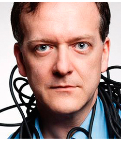
Marco Olivotto
Color Correction & Retouch
Teacher, consultant and writer in the field of color manipulation and reproduction
www.marcoolivotto.com
![]()
Marco Olivotto is a member of EIZO’s ColorEdge Ambassador Program, which showcases professional photographers, designers, filmmakers, and other creatives who are committed to inspiring and educating artists around the world of all levels.
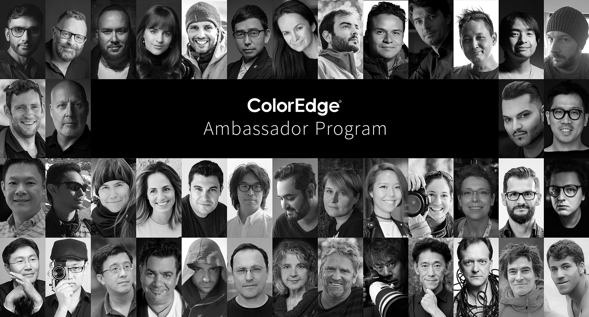
ColorEdge Ambassador Program Website