Case Studies
Marsel van Oosten - Wildlife Photographer
Can you tell us a little bit about yourself?
 I am a professional nature photographer from the Netherlands. Together with my wife Daniella we run Squiver, a company that organizes specialized wildlife and landscape photography tours for small groups of all experience levels to spectacular locations worldwide. My images are most known for my graphic approach to composition. In my work I try to simplify, to get rid of the extraneous: Simplicity is the ultimate sophistication.
My first career was in advertising, where I worked as an art director for 15 years. Photography started as a hobby and a way to escape from life in the fast lane. The hobby eventually got totally out of control, to the point where I decided to turn my hobby into a full time job. I like to create, to be surrounded by nature, and to travel - in this job I can combine all that.
What is important in your work?
The most important thing for me is to have fun. Life is too short to do things that don’t make you happy. So for my photography I always choose subjects and locations that inspire me, and that fit my photographic style. As a so-called aestheticist, I focus on beauty in my art more than anything else, and I have a very clear view on what I like and what I don’t. More often than not, the overall look or setting is more important to me than the actual subject. Hopefully, my work will not only entertain a lot of people, but also create a sense of awareness about the natural world and that it’s important to protect it.

Is it true that you’re a perfectionist?
Very much so, yes. As a nature photographer you have very little control over your subjects and the conditions, so I try to control as many of the remaining factors. The difference between a good photograph and a great photograph is often in the details. Whether it’s the way I prepare for a project, how I photograph, or how I process my images - excellence is in the details.

Why did you choose the ColorEdge CG247X?
When I was looking for a new monitor for our office in South Africa, I knew I would have to be an EIZO again. EIZO’s ColorEdge product line was developed for photography, print, and post production professionals. So which one did I pick? My choice may surprise you.
For the past six years, I have been doing all my processing on an EIZO CG245W - the world’s first self-calibrating monitor - and it’s still going strong. It wasn’t cheap, but if you’re serious about your photography, it makes very little sense to get yourself the best cameras and lenses and then settle for a so so monitor. Actually, I dare to say that the quality of your monitor may sometimes be even more important than the quality of your cameras or lenses. After all, what’s the point of buying the best camera gear if your images end up having a color cast or no shadow detail? My CG245W has been very reliable, giving me consistent results over many years.
My trusty CG245W is a 1920x1200 monitor. At the time this was considered pretty large, but things have changed over the past six years. Both televisions and computer monitors have grown significantly, both in physical size as pixel dimensions. Late 2012 the first 4K television was introduced and it’s just a matter of time until we see the first 8K televisions appear. Most people who buy a tv today, will buy one that’s larger than their previous one. The same applies to computer monitors: most photographers who buy one today, will get a larger one.
But not me. After careful consideration, I decided to stick to 1920x1200 pixels. Let me explain.
The Pixel Race
It’s not just the televisions and monitors that have gotten more pixels over the years, the same thing happened to cameras. Six years ago, I was shooting with Nikon’s top of the range product, the D3s - a 12 megapixel camera. I am now shooting with a Nikon D850 that has almost 50 megapixels. Instinctively, you’d think that it makes sense to use a monitor with more pixels when you’re processing images that have more pixels too. This is not the case. I love my cameras to have a lot of megapixels, because the more pixels, the larger the file. And the larger the file, the larger I can print without having to interpolate the data. It’s quite simple.
So how does this work with monitors?
3K vs 4K
Let’s say you have two monitors that have exactly the same physical dimensions, but one is 2K (1920x1200) and one is 4K (3840x2160). Contrary to what you might think, the 4K monitor will have almost four times the amount of pixels compared to the 2K monitor. The more pixels your screen will have for a physically equivalent size, the more subtle they will be. The word used to define pixel size is pitch, so the smaller the pitch, the less visible those pixels are. As a result, your images will look better on the 4K monitor - smoother, and more like a print.
However, this comes at a cost. On a 4K monitor your images will appear to be a lot smaller, and for me, that’s a deal breaker.
Post-Processing
 The majority of my images appear online. That means that I spend most of my post-processing time on images that are resized to about 1,600 pixels wide. When I work on a 1,600 pixel image at 100% in Photoshop, the image will almost fill the entire screen - there’s just enough space on the left and right for the tools. This is important for me, because it’s easier to see what you’re doing when you’re working on fine-tuning the details, like for instance sharpening.
When I open that same 1,600 pixel image in Photoshop on a 4K monitor, the image won’t even fill half the screen. It will most likely look better because of the higher pixel density, but processing a relatively small image like this will be difficult. To be able to see what you’re doing, you would need to zoom in on the image, but that would result in poor quality and it would totally defeat the purpose of a 4K monitor.
This is why I chose the ColorEdge CG247X.
The design
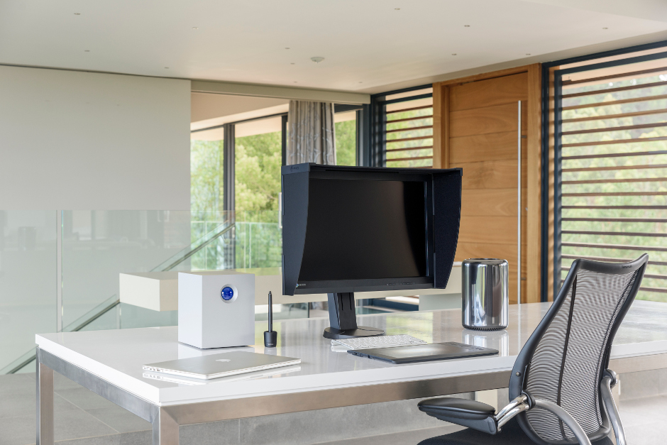
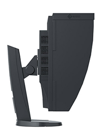 The design is nothing to get overly excited about - it’s purely functional. What’s important is that you can move the screen up and down, and you can tilt it to get the best viewing angle. This screen can also rotate to a vertical position, but I have yet to find a reason to do so. Spending some time on a good ergonomic workspace is worth the effort: a good chair, desk and monitor, all at the right height.
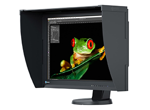
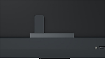
The monitor comes with a dedicated monitor hood to prevent glare and reflections. This hood is a major improvement - it’s very easy to attach and to remove again as it uses magnets. It’s probably a good idea to always have this on.
On the front of the monitor there’s a row of buttons that you can use to change the settings. The proof of good design is when you don’t need to read the manual to figure out how things work. The so-called Button Guide is an overview function on the monitor, and it will show you the function keys above the control panel. The buttons are backlit, so they’re easy to find even in dark environments. However, you will probably find that, once everything’s set to your preferences, you will hardly ever need to use these buttons.
On the back of the screen there is a DVI-D, an HDMI and a DisplayPort input. The monitor comes standard with a DisplayPort to Thunderbolt cable, so that’s the one I’m using to connect the screen to my MacPro. HDMI is a good alternative, which is better than DVI-D.
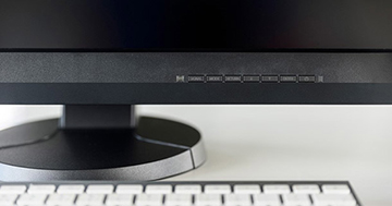

By using the DisplayPort or HDMI connections you can benefit from 10 bit color depth. In 10 bit you get 64 times more colors than with an 8 bit display. That means a billion colors with finer color gradations and smaller differences between adjacent colors. Also, with the 10 bit grayscale range activated, you get between 6-14% more grayscales.
There are also two USB ports on the back, one for upstream and one for downstream. There is a little latch in the stand that works as a cable organizer: simply open the latch, feed all the cables through the opening behind it, and close it again. Unless you really like the cable spaghetti look.
The Panel
 The panel is the most important part of any monitor, and most of the screens you see nowadays are of the glossy kind. My MacBook Pro and my iPhone have glossy screens, my wife’s iMac has one, and even my camera has one. What’s great about those glossy screens is that they make images look punchy with plenty of contrast and vivid colors. But they also suffer from an incredible amount of reflections.
The CG247X uses a Wide Gamut IPS panel with an anti-reflection coating. Together with the monitor hood this ensures that glare from the spread of the reflected light is minimized, and that the monitor provides a wide viewing angle without annoying reflections. This also protects your eyes from excess strain, which is also helped by the fact that the monitor is flicker-free at any brightness setting. Another advantage of using a matte screen is that you get a more print-like appearance.
Thermometer
Believe it or not: this monitor has a built-in thermometer. Colors can change as a result of fluctuations in room temperature, and those color deviations are eliminated and automatically reduced. Another advantage is that brightness, color and tone values have already stabilized in just seven minutes. This is a quarter of the time normally required and means that right from the start the color rendering remains constant over a long period of use.
Constant Tones
The CG247X uses the Digital Uniformity Equalizer (DUE) to control all tone values over the entire monitor, pixel by pixel. As a result color tones appear identical at each point on the screen, without the brightness fluctuations you experience in conventional LCD’s. Fluctuations in ambient temperature can have an effect on the color temperature and brightness, and the DUE function balances out these effects. Perfect color purity and even luminance distribution is vital when you’re processing your images.
Color Space and Wide Gamut
 A color space is like a language that describes what the red, green and blue values in your images really mean. There are two main color spaces that most photographers use: sRGB and Adobe RGB.
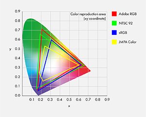
sRGB stands for standard red, green, blue. It’s the color space used on the internet, most computer monitors and mobile devices. The Adobe RGB 1998 color space has a gamut that’s over 30% larger than sRGB. This means there are more colors and they tend to be more vibrant. To show the difference between color spaces, they are often mapped onto a model of the largest color space we know: the one that defines the number of colors the human eye can distinguish - the CIE XYZ color space.
If you do any serious printing or sell images to magazines, then Adobe RGB is your best choice. Most professional printing labs can print Adobe RGB, so it makes sense to use this larger color space. However, not all monitors can display all the colors that are available in Adobe RGB, so you need one that does.
Reproduces 99% of the Adobe RGB Color Space
 The panel of the CG247X is a so-called Wide Gamut panel. This means that it can reproduce 99% of the Adobe RGB color space. If you’re using Adobe RGB as your main color space, this monitor will display them absolutely correctly.
The most obvious advantage of using Adobe RGB is in the cyan-green hues. If you're working on an image that has very lush, vibrant greens, then there will be more of those colors in an Adobe RGB version than in an sRGB one. Similarly, if you have shot an image with rich and vibrant cyan hues, more of those colors will be preserved in the Adobe RGB color space. If you want to print such images, you need to be able to see those colors in order to correctly process them in for instance Lightroom or Photoshop.
However, most browsers and PC's are based on the much smaller sRGB color space. If you want to share your images on the internet, it is therefore better to convert your images to sRGB. If you don't do this, your images will look dull and flat.

Vibrant cyan hues are notoriously difficult to preserve when converting an image from Adobe RGB to sRGB. The image you see above consists mainly of those cyan hues, and it looks perfect on my CG247X. But the moment I had to convert it to sRGB, a large amount of those tones disappeared. That is frustrating, but at least I know what the true potential of the image is and that I can preserve all those tones when I use the right printer. When you work on an sRGB monitor, you will never be able to see what colors are actually in your image.
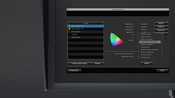
Calibration
The key to getting consistent, reliable results is regularly calibrating your monitor. Almost always when photographers are struggling to get their prints to look like what they’re seeing on their screen, it’s because their monitor is not properly calibrated (or they’re using different color profiles). Good image editing can only take place with a well-calibrated monitor.
There are dedicated external devices that you can use for this, but I find them needlessly complicated and cumbersome to use. Probably the greatest thing about the CG247X is that it has an integrated sensor to achieve maximum color accuracy. The sensor itself is hidden inside the lower part of the housing frame of the monitor. Only when calibration is needed, it comes out. It is perfectly tailored to the monitor, taking into account influences like ambient light, and correlates the middle and edge of the image.
Standard software calibration can take a long time and often requires the user to have technical expertise. The CG247X is delivered with the ColorNavigator 6 hardware calibration software. It can even be performed by users with no technical expertise in just a few steps. Advanced users can enter numbers for brightness, gamma, white point, and other calibration settings as target values. As the calibration uses the monitor's hardware, it takes place without losses and independently of the computer and graphics card.
But it gets even better: you can simply define the time at which calibration needs to take place and the monitor will perform calibration fully automatically, meaning you can perform calibration during your lunch break or at night. The computer does not even need to be turned on for this!
I really cannot stress the importance of a properly calibrated monitor enough. No matter how expensive your camera gear or your computer is, if you work on a monitor that's not calibrated you can never expect the best results. Let me give you a recent example.
Earlier this year I have been shooting in the deserts of Botswana and Namibia for the global introduction campaign for the Nikon D850 and the resulting night time-lapse Hercules Rising. When you're shooting at night, you're pushing your camera to its limits - how to get as much shadow detail without creating noise. But the challenge continues once you start processing your images.
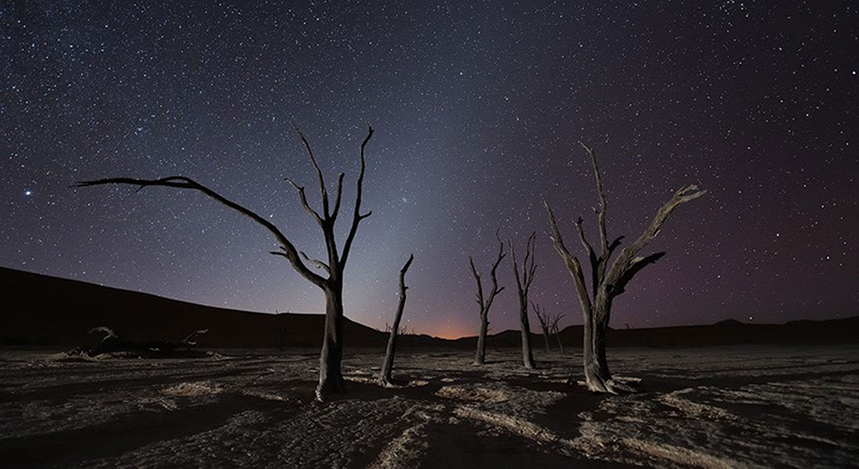
When you work on your night images in photo editing software, you need to be absolutely certain that your monitor shows you the RAW file as it really is. If your monitor is not properly calibrated, the dark tones may look too dark, and you will be tempted to brighten them - thereby introducing noise. I did all the processing for Hercules Rising on my CG247X, so I was confident that everything I did was correct. This was proven when I sent all the processed files to the post production company that did the final editing and color grading - the images looked exactly the same on their calibrated (EIZO!) screens.
Conclusion
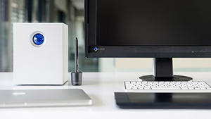
Even though photography, time-lapse, and post-processing can all be very technical, I don't particularly enjoy the technical part. Instead of spending time on settings and calculations I much rather spend my time on creating great images. That's what I like about my MacPro, it's what I like about my LaCie RAID system, and it's what I like about my CG247X. Straight out of the box it gives great results and changing the settings or starting the calibration procedure is super easy. And when things are easy, it is a lot less likely that you'll make a mistake. Monitor calibration can be a very confusing and needlessly complicated thing, but with this monitor it isn't. Over the past six years my CG245W has proven to be extremely reliable, and I'm looking forward to a similar experience with the CG247X.
A monitor like this is not very sexy, but it doesn't need to be. All I want is that it gives me consistent accurate results, and that it doesn't let me down. So far it hasn't disappointed, and I don't expect it will.
If you are serious about your photography and put a lot of effort into post-processing, then you should definitely consider this monitor. It's relatively compact and cheaper than its larger 4K brothers, but not less capable in terms of image quality. Highly recommended.
![]()
Marsel van Oosten is a member of EIZO’s ColorEdge Ambassador Program, which showcases professional photographers, designers, filmmakers, and other creatives who are committed to inspiring and educating artists around the world of all levels.

ColorEdge Ambassador Program Website