ColorEdge
UniColor Pro ― Color Universal Design in Practice
| About UniColor Pro |
What is Color Universal Design? |
Color Universal Design in Practice |
Simulating Color Blindness |
Color Universal Design in Practice
Why is Color Universal Design so important now?
In 21st century society, use of color is increasingly becoming an important means of information transmission. Several years ago, for example, black and white printing was the norm for newspapers, magazines, textbooks and general publications. But recent development of color printing technology has dramatically turned them into color. These days, even simple guide maps would look rather inadequate unless they were in color. Color has also been introduced to the operation screens of photocopiers, or mobile phones, automatic ticket-vending machines, automatic teller machines (ATMs), etc., and most such screens are now in color. The use of a variety of colors has also become the standard for electronic information boards. Electronic devices and home electric appliances used to have pilot lights with a simple on/off function, but they now commonly come with new types of lights which illuminate in a number of colors to convey information in various different ways. Color-coding is in place in public facilities, museums, exhibition sites, etc., where rooms and areas are divided according to theme colors and full of colorful information displays. At railway stations, train lines are color-coded for direction purposes; route maps and time tables are illustrated with lines and characters in a variety of colors.
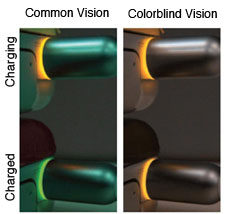
As described above, there are so many more scenarios where color is a tool for conveying information, compared with one or two decades ago. However, many color displays are still designed with only common-type color vision in mind. As a result, there are more and more cases like the charging adapter shown in the photograph below, where the information provided is difficult for colorblind people to read, resulting in inconvenience to them. In our current society, life is ironically becoming even harder for the colorblind. Color Universal Design has been developed to resolve this major issue. Giving consideration to Color Universal Design allows you to use color effectively and create colorful designs that everyone will think beautiful, while still conveying information accurately.
Valuable to everyone regardless of color vision type
|
Color Universal Design is not a "peculiar design concept developed only for some colorblind people and rather difficult for people with common-type color vision to see". The purpose of designing with the colorblind in mind is to completely reexamine the existing inconsistent color-designing procedure that tends to increase the number of colors unnecessarily, establish an order of priority for information elements to be conveyed, and create designs that take into account the impressions and psychological effects they may give to the receiver of the information. Color Universal Design is focused on ease of use from the user's perspective, rather than only relying on the designer's aesthetic sense and sensitivity. This will result in "well organized easy-to-see designs" for people with the common-type color vision as well. Therefore, Color Universal Design is valuable not only to the colorblind but also to everyone. |
|
"Color Barrier-free" - The trend of the times
Thoughtful use of color to ensure that the colorblind are not disadvantaged is called a "color barrier-free" presentation. Until recently, vision-related barrier-free activities were designed only in consideration of people who can hardly see. However, the importance of color barrier-free presentations is becoming increasingly recognized at a rapid pace. For example, both Section 508 of the Rehabilitation Act in the US, enacted in 1998, and Phase III of the Disability Discrimination Act in the UK, started from 2004, explicitly call for the consideration to people with disabilities including the colorblind among others.
Effective cases of Color Universal Design
| Public facilities | At public facilities such as hospitals and government offices, careful thought must be given to floor directories and warning signs, color schemes for application forms, electric displays in reception areas, color-coding for items to be handed over to the user of the facilities such as medicines, etc. At hospitals, in particular, extreme care must be taken as they are frequented by the elderly as well as eye patients. |
|---|---|
| Museums & exhibition sites | In addition to the above, attention must be paid to how to make descriptions of exhibits easy to understand. |
| Railway stations & airports | Consideration must be given to route maps and directional signs on platforms, electronic information boards to indicate departures and arrivals, etc. |
| Roads | Attention must be paid to road signs and color tones of lines painted on roads, electronic information boards that indicate road information such as traffic congestion, etc. |
| Schools & prep schools | Consideration must be given to the colors of chalk and marker pens, the selection of teaching materials, etc. |
| Newspapers, magazines, text books, reference books, operation manuals, PR magazines for local governments & companies | Careful thought must be given to font coloration, color schemes, line types and color-coding within descriptive figures and graphs, legend indication methods, etc. |
| Maps, route maps, guide maps, car navigation devices & globes | Attention must be paid to color schemes for color codes, line shapes, legend indication methods, etc. |
| Ticket-vending machines & ATMs | Consideration must be given to color schemes and designs of operation screens. |
| Electronic devices | Consideration must be given to operation indicator lights and operation screens of photocopiers, fax machines, PCs, etc. |
| Home appliances | Consideration must be given to operation indicator lights of electric rice cookers, electric kettles, microwave ovens, etc. |
| Audiovisual equipment | Careful thought must be given to operation indicator lights and operation screens of TVs, VCRs, etc. |
| Cars | Consideration must be given to display colors on meters and to designs of operation panels. |
| Medicines | Attention must be paid to color-coded displays of medicine type and dose, particularly for those prescribed at hospitals and pharmacies. |
| Stationary | Consideration must be given to color schemes for color-coded filing products such as document folders and binders, ink colors of ball-pointed pens, as well as how to make it easier to distinguish one color tone from another for the colors used in 8 and 12 color sets of marker pens, colored pencils, crayons, paints, etc. The correct color name should also be clearly shown on each item. |
| Websites | Careful thought must be given to font coloration, color schemes for descriptive figures, and also the selection of background color. |
| PC software | Attention must be paid to how to display each type of screen. |
The above excerpt is from EIZO's "Color Universal Design Handbook" which is based on material issued by the Color Universal Design Organization (CUDO), a non-profit organization in Tokyo, Japan.