Monitor Basics in Plain English
The difference in image quality is perfectly obvious! - Let's check the LCD's display
- Security
- ATC Resources
- Monitor Basics in Plain English
- Integrated Production – Made in Japan
- Expert Advice – The Best Way to Invest in Your Home Office
- FlexScan EV2795: A Writer’s Extensive Review
- Efficient Telecommuting with a Laptop and Monitor
- What is the Optimal Display for Watching Video? – The OLED Revolution
- Integrated R&D, QC, and Production
- Adding a Touch of White
- HiDPI
- What We Discovered After Trying Five EIZO Monitors in our Editorial Department
- Poor Work Efficiency
- Improve Work Efficiency by Combining an External Monitor with your Notebook PC
- EIZO Monitor Test
- Windows 10 Creators Update
- What is USB Type-C?
- Modern Video Inputs
- Windows 10 Multi-Display Function
- EIZO and Mac – The Perfect Match
- Implementing 4K Monitors
- 10 ways to address eye fatigue caused by displays
- EIZO 4K Monitors – high definition and large screen sizes
- Confused about HiDPI and Retina display? ― Understanding pixel density in the age of 4K
- EIZO Optical Bonding
- How to Address Computer-Related Eye Fatigue
- Pixel Pitch and Enlarged Mode
- Native Resolution and Enlarge Mode
- How can a screen sense touch? A basic understanding of touch panels
- Is the beauty of a curve decisive for color reproduction? Learning about LCD monitor gamma
- Smoother Video with Cutting-Edge Technologies: LCD Monitor I/P Conversion
- Altering color dramatically with a single setting: Examining color temperature on an LCD monitor
- Maximum Display Colors and Look-Up Tables: Two Considerations When Choosing a Monitor
- DisplayPort to D-Sub: The Full Range of LCD Monitor Video Input Interfaces
- The Ability to Display Color Correctly Is Vital: Understanding the Color Gamut of an LCD Monitor
- The Making of a FlexScan Monitor
- Are the response time figures true? A close look at LCD video performance
- The difference in image quality is perfectly obvious! – Let's check the LCD's display
- Making Full Use of the "External" LCD with Laptop Computers
- Videos
- Color Management Resources
- Healthcare Resources
Published: April 22, 2010
See our article Color Management for Creators for more recent information.
Have you ever properly checked the display quality of the LCD you habitually use? Very often people become aware of previously unnoticed problems in display quality when they run a check using test patterns and so on. This time we are going to talk about the basic points used to assess LCD display quality, and show you a simple way to test it.
Below is the translation from the Japanese of the ITmedia article "The difference in image quality is perfectly obvious! – Let's check the LCD's monitor" published April 22, 2010. Copyright 2011 ITmedia Inc. All Rights Reserved.
Is the image quality of the LCD on which you are reading this page OK?
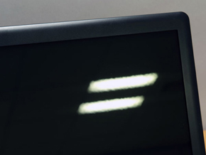
First of all, bear with us in the following simple test. Below is image data of a row of three squares. In the center of each square is a letter so faint as to be barely distinguishable, so there are three letters in all. Read from the left they make up a word. Can you see that hidden word?
|
|
|
If you look closely at the white, gray and black squares, there is a letter concealed in each of them |

That's right. The answer is "LCD" (it is displayed if you drag the space between the brackets). We assume that probably many users could read the letters concealed in the squares.
So, the next test is much more difficult. A word is concealed in the four squares below, just as in the image above. The letters are written in colors that are very similar to those of the boxes and we expect that, in many cases, it is hard to distinguish them in your browser. We would like you to download the image and check it closely in photo retouching software or a viewer that is capable of accurate color reproduction.
|
|
|
At first glance it is a series of four boxes with a color gradation from white to black, but a word is concealed in them |

This time the answer is "EIZO" (it is displayed if you drag the space between the brackets). Depending on the lighting or the user's environment it may be hard to make out but, if you can read these four letters, the display quality, or more accurately the still image gradation expression, of your LCD is extremely high.
However, you should probably doubt the display quality of your current LCD if you couldn't read them at all even when you stared at the screen.
A thorough check of LCD display quality using test images!
|
Let's check the quality of your LCD! |
Let's get down to details then. "Image quality" is the top priority of the LCD, of course. However, recently LCD prices are fiercely competitive and there are surprisingly few products that insist on high image quality and performance. It may be nice to be able to get hold of a wide-screen monitor with full HD (1920 × 1080 dot) resolution or higher fairly cheaply, but it cannot be denied that such LCDs tend not to place too much importance on display quality. On the other hand, the increasing opportunities to enjoy things like HD videos and games, and high resolution digital photographs on the computer make LCD display quality even more important. As far as possible it's best to use an LCD with excellent display quality in order to fully enjoy the charms of the visual content. |
Even so, perhaps you think that there can't really be that much wrong with the LCDs that so many people are using at the moment. Here we would like to show you a simple method to check LCD display quality. You can get a good idea of whether the basic display quality is good or bad just by looking at how some simple test images are displayed, just like in the introductory quiz. First of all, we would like you to get a sense of how important it is that "image data can be properly displayed" by checking the display of the LCD that you currently use, (that's right, the one you are using to view this page!).
The test items use color / monochrome patterned images to check gradation expression, and simple images to check brightness / chromaticity variation. Downloads are available of several test images, such as gradation patterns. We would like you to display the downloaded test images in photo retouching software or a viewer that can reproduce color accurately. As we mentioned at the start of this article, you have to be careful as in many cases colors cannot be displayed accurately in web browsers. (Currently only a few browsers such as Safari and Firefox 3.x can handle color management).
Before starting your visual check of the display quality, please return to your LCD's setting to default, and select Adobe RGB or sRGB as the image quality mode. If these modes are not available it is fine to set the color temperature to 6500K and gamma to 2.2. If you cannot adjust the color temperature and gamma, simply adjust the brightness and contrast so that they are easier to discern. Of course, if it's an LCD environment that has been color calibrated it's OK to leave it as it is.
The average LCD takes some time for the monitor to stabilize after it is switched on so, after start up, please wait at least 30 minutes or so before doing the test. (Most EIZO monitors are an exception to this as they are equipped with our proprietary dimming function and the monitor stabilizes in a short time after start up.)
We would also like you to adjust the monitor stand so that things like the room's lighting are not reflected on the screen. You have to be particularly careful with products that have a glare (glossy) type screen as they are highly reflective. Visual assessment is impeded when ambient light is reflected. It will be much easier to make an assessment if you turn off the room lights at night and exclude as much ambient light as possible. This applies for both glare and non-glare (matte) types.
|
|
|
|
|
The surface treatment of an LCD makes a difference to the background reflection. Glare panels impede the surface diffusion of backlight, which does make it easier to achieve high color purity, but also makes distinct reflections of the user or lighting much more likely (photo on the left). |
||
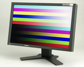
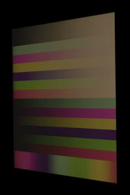
For your reference, we ran a test on an EIZO 24.1-inch wide-screen LCD, the FlexScan SX2462W, for this article. The FlexScan SX series comes with a number of high image quality functions and boasts top class display quality as a general-purpose LCD intended for a computer.
When we displayed the quiz images (the more difficult ones, of course) on the FlexScan SX2462W, the four letters appeared faintly when we stared closely at the screen and we could read what they said. This indicates the high image quality level.
Gradation expression: Check 1
When checking the display quality of an LCD it is comparatively easy to understand the gradation expression capability by a visual check. Let's display color and monochrome gradation images and check whether the entire image is smoothly reproduced. If there is a problem with the gradation expression it produces things like blocked-up shadows in dark areas and blown-out highlights in light areas, banding (vertical or horizontal stripes) in the middle gradations, and color cast, so you should check for problems like these.
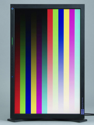
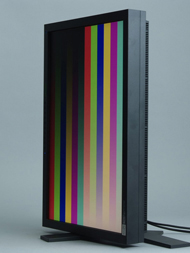
Test images of color / monochrome gradations are shown below. Each test image is prepared for three resolution levels (1280 × 800 dots / 1680 × 1050 dots / 1920 × 1200 dots). When you click on an image it is displayed in that actual resolution. We would like you to download the images in the resolution which matches that of your current LCD. Gradation expression can vary according to whether the image is viewed horizontally or vertically, so it will be more effective if you rotate these images and view them vertically as well.
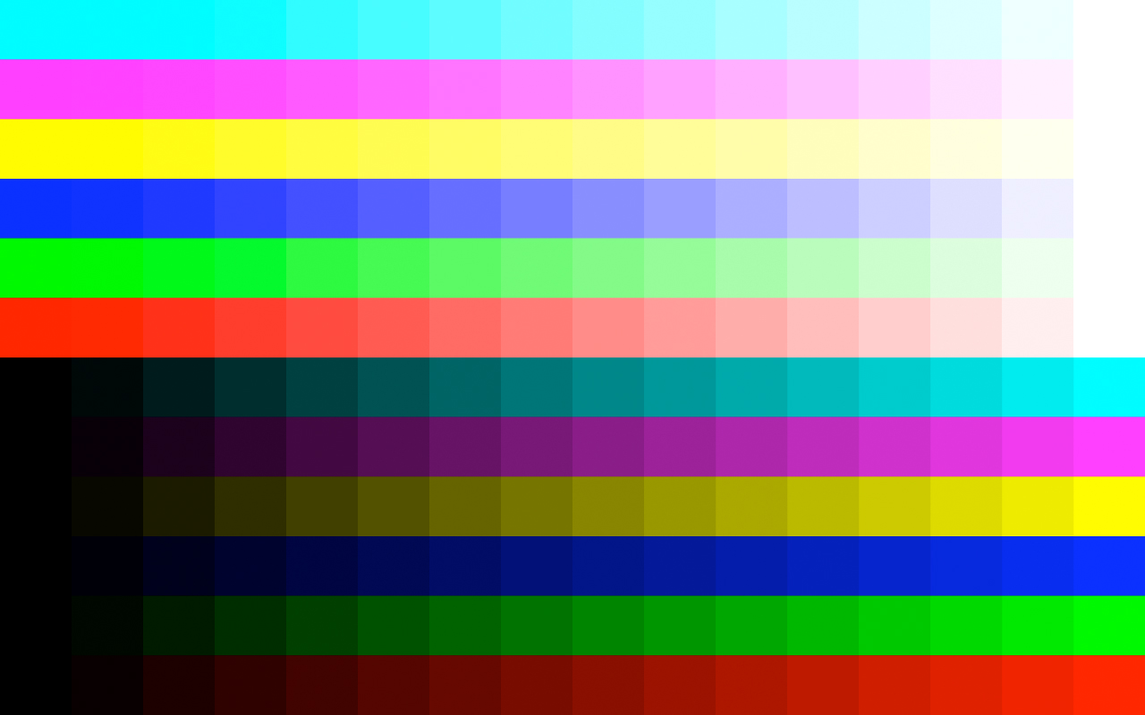
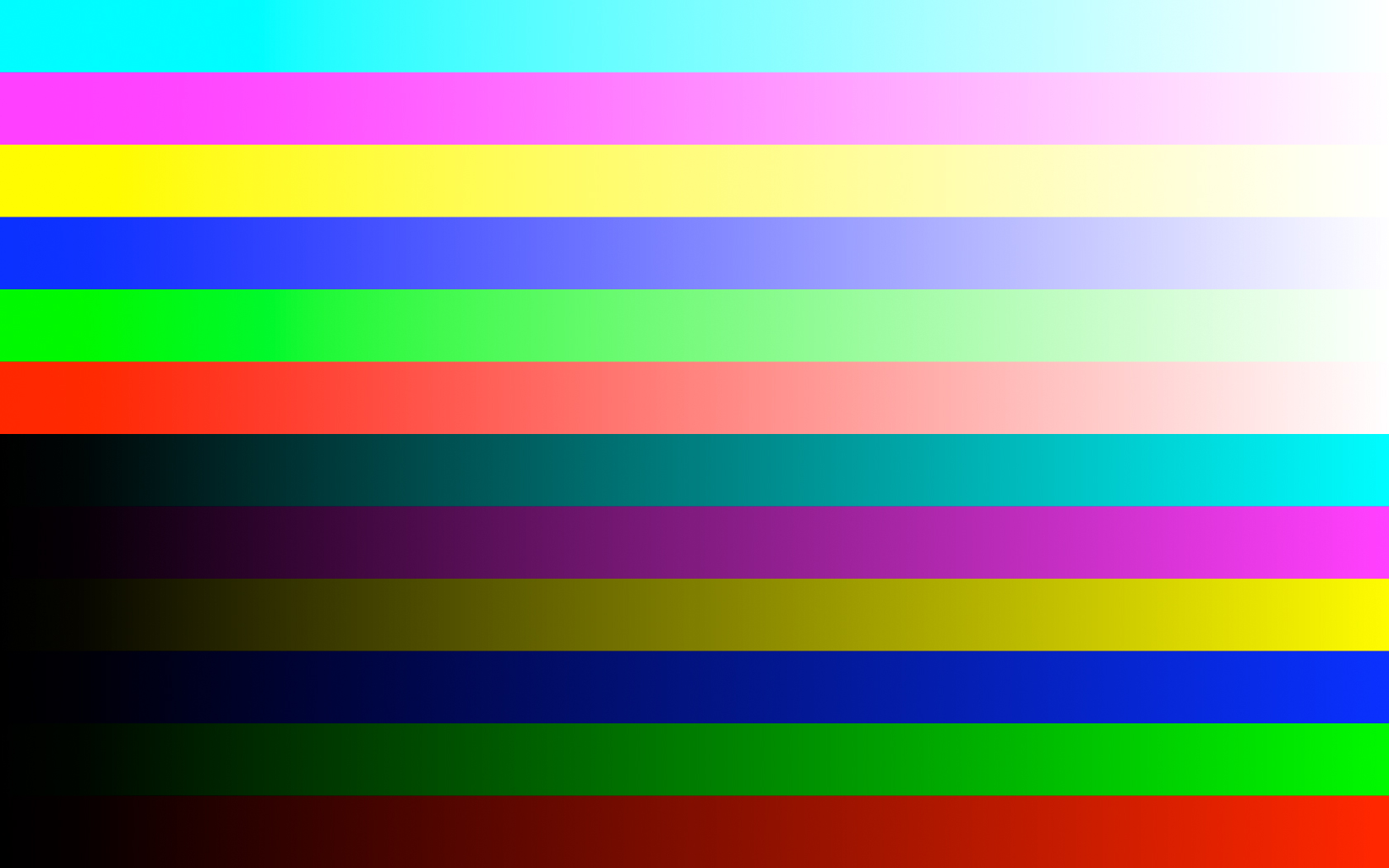
16-level color gradation (Level of difficulty: Easy)
A gradation pattern where the colors red, green, blue, cyan, magenta and yellow go through 16 gradients as they change to white or black. This is an easy test image so we expect that it can be seen in most environments that each color bar is divided into 16 blocks.
16-level color gradation |
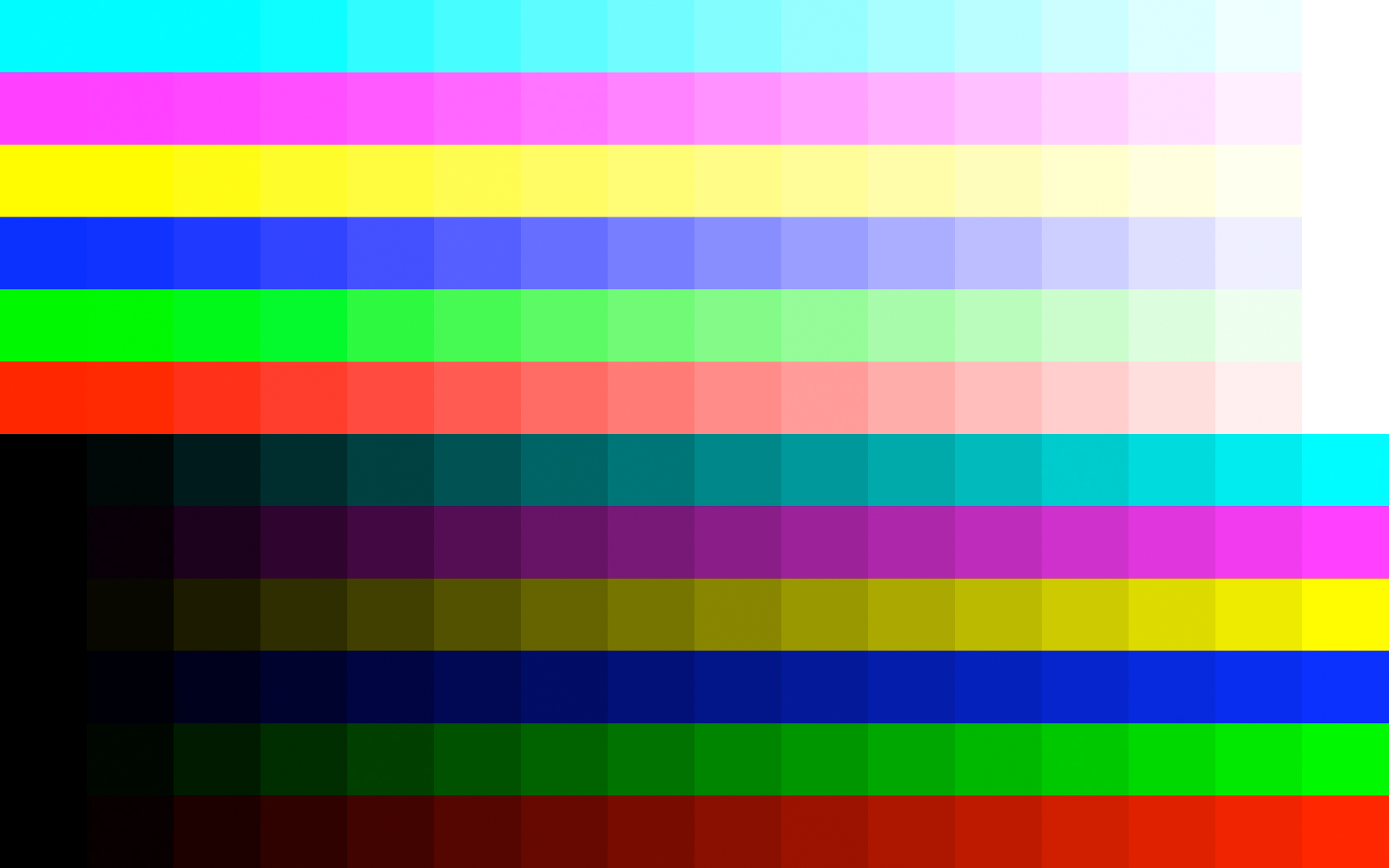
16-level color gradation |

16-level color gradation |
64-level color gradation (Level of difficulty: Medium)
A gradation pattern where the colors red, green, blue, cyan, magenta and yellow go through 64 gradients as they change to white or black. Each color bar is divided into 64 rectangular blocks. With this many gradients we expect that many LCDs will find it hard to make distinctions in the dark areas or the areas that are close to primary colors.
64-level color gradation |
64-level color gradation |

64-level color gradation |
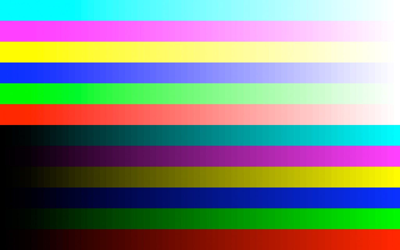
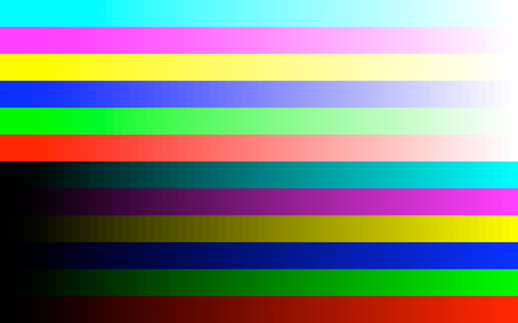
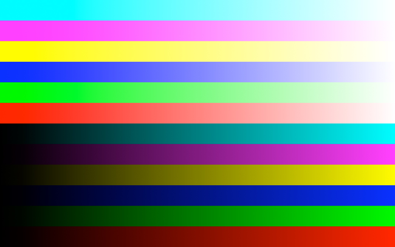
Smooth color gradation (Level of difficulty: Hard)
A smooth gradation pattern where the colors red, green, blue, cyan, magenta and yellow go through 256 gradients as they change to white or black. At this level of difficulty you cannot distinguish between adjoining colors from a distance but, if you have an LCD with excellent gradation expression, if you look closely you should be able to see that each color is divided into thin rectangular blocks.
Smooth color gradation |
Smooth color gradation |

Smooth color gradation |
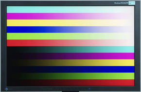
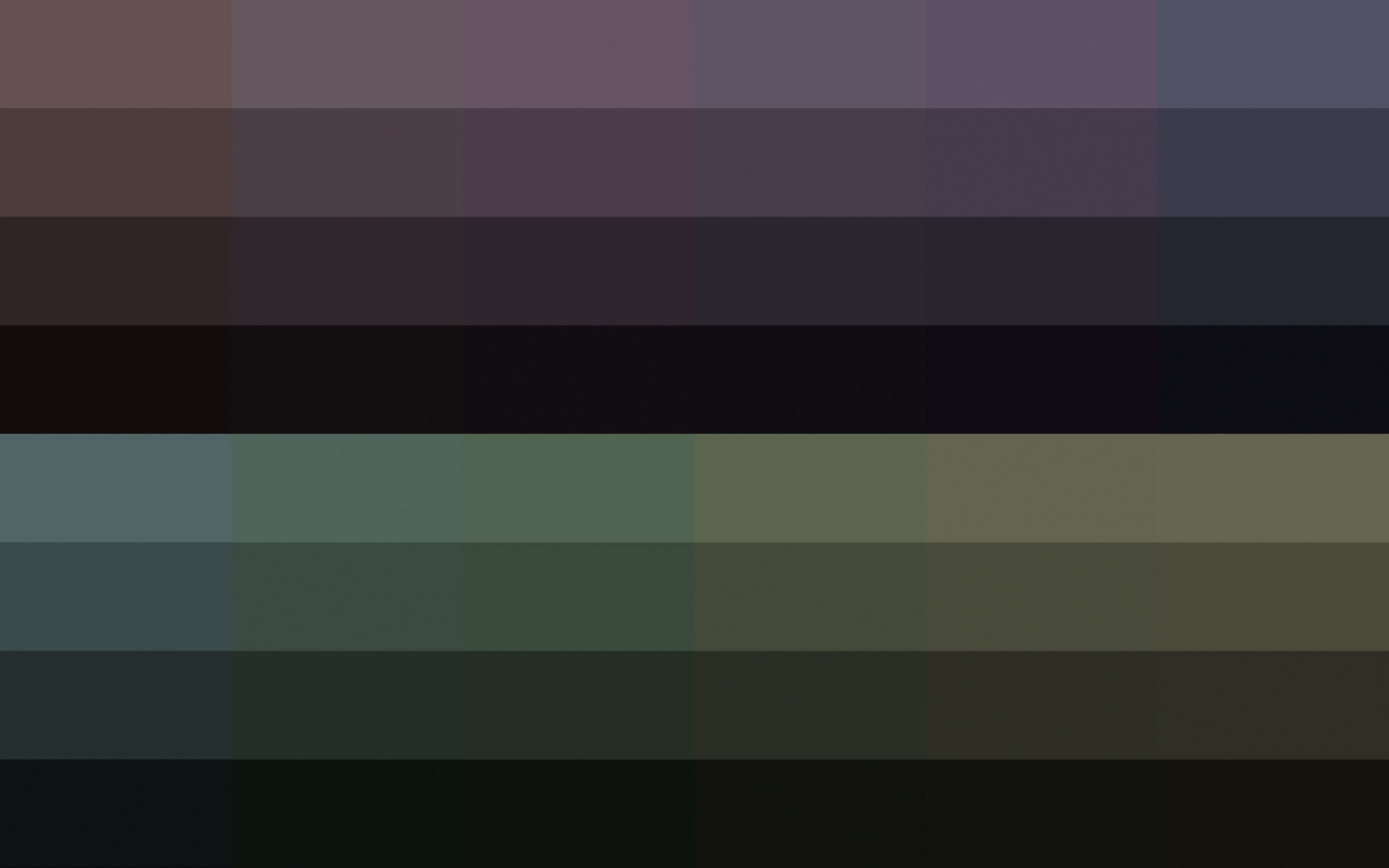
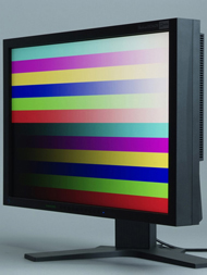
Monochrome gradation (Level of difficulty: Easy – Hard)
A gradation pattern that changes from black to white. It is divided into 5 horizontal bars: from the top, smooth, 128 gradients, 64 gradients, 32 gradients and 16 gradients. Even if all the differences can be distinguished in the 16 and 32 gradient patterns near the bottom, we expect that there will be some parts in the 64 and 128 gradient patterns where it is hard to see the boundaries between adjoining colors. With this kind of monochrome test image you should also check whether any unnecessary colors are mixed with the gray.

Monochrome color gradation |

Monochrome color gradation |

Monochrome color gradation |
On an average LCD gradations of gray that are close to black tend to appear as blocked-up shadows (gradations of gray that are close to white are displayed comparatively accurately). If your LCD's OSD menu allows you to adjust the contrast, please try gradually turning down the contrast. Turning down the contrast often makes it possible to see gradations that had been subject to blocked-up shadows or blown-out highlights.
Probably most LCDs will be able to detect some degree of banding and color cast in the middle gradations. Banding in the middle gradations is tone jump (Missing gradations) and, along with color cast, means that the RGB gamma curves are unequal. Unlike blocked-up shadows or blown-out highlights, this is an area that it is hard to improve with adjustments made by the user.
When there is a problem with the gradation expression, the original colors of the content being displayed cannot be reproduced. If you look carefully at displays like video, games or photographs you can probably see or sense things like a lack of depth in the coloration, unnatural color shifts in the middle gradations or displays blanked out with large blocked-up shadows. Of course, it is very hard to use such monitors for things where color reproduction such as photo retouching or graphics work.
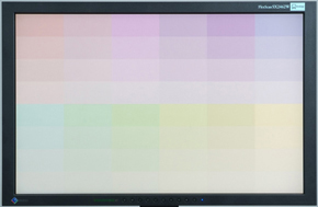
When we looked at these test images on the FlexScan SX2462W, in the smooth gradation there was blocked-up shadows right next to the black but we could distinguish differences in gradations of gray until very close to the black area. When it comes to such subtle gradation distinctions the brightness of the room and the adaptability of the eye come into play, so the range that is visible will vary according to the environment and the individual. The gradation expression was excellent, with almost no blown-out highlights in light areas, middle gradation banding or color cast.
The FlexScan SX2462W has a 16-bit look-up table (around 278 trillion colors). It converts the 8-bit RGB input from the computer into multiple tones and then reallocates them in 8-bit RGB for their display. (10-bit display is also supported with the DisplayPort input)
This aligns RGB gamma curves for the entire gradation range from dark to light, making it possible to depict subtle gradations and thus eliminating banding and color cast in the middle gradations.
 |
 |
|
|
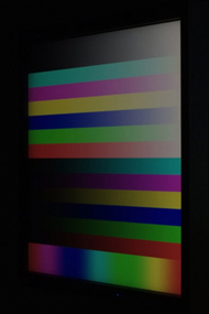
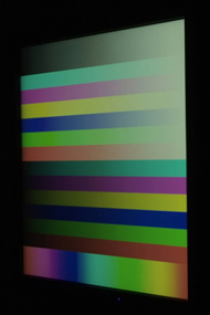
Smooth color and monochrome gradations displayed on the FlexScan SX2462W. This data is of screen displays photographed with a digital camera so some of the gradations may seem to have been destroyed, but they were cleanly represented when checked visually. |
||
| The human eye is surprisingly easily tricked, so watch out! | ||||||||
|---|---|---|---|---|---|---|---|---|
|
We have talked about ways to check gradation expression. We think that it was comparatively easy to understand about blocked-up shadows in dark areas, blown-out highlights in light areas and banding in middle gradations. However, it is hard to distinguish whether a gradation is being cast with unnecessary color so we would like to add a little more about this. Below is a row of images of seven slightly different grays. Only one is a neutral (with no color cast) gray. Can you tell which one it is?
The answer is "The far right" (it is displayed if you drag the space between the brackets). If the other grays looked correct, color may not be being correctly recognized for a variety of reasons, such as the lighting environment or the LCD settings. For example, when the room is lit with standard household incandescent lights white and gray look reddish, while fluorescent lights can make them greenish (which is why there is some lighting that is made to conform to color evaluations). What is more, white and gray can have a reddish tinge when the monitor has been set to a low color temperature, while a high setting can give them a bluish tinge. Thus it often happens that the gray in visual data does not look like a true gray. Another big problem is that the human eye (brain) is easily influenced by surrounding colors. Everyone has probably experienced the phenomenon where, when you come from outdoors into a room lit with incandescent lights, the room seems to be bathed in a reddish light at first but, as your eyes gradually get used to it, you lose all awareness of the redness. The two image patterns below are easy to understand examples of optical illusions. When you look at them you should be able to understand how heavily the human eye is influenced by surrounding colors.
The human eye has adaptability that it is applicable to a variety of environments, so it is extremely difficult to accurately distinguish color by a visual check, even for color professionals. Big shifts in color can probably be seen but it cannot be helped if very slight color casts go unnoticed. The important thing in actual use is that you should not adjust the image quality of your monitor or edit visual material while looking at colors that are being wrongly recognized like this. There are some products where the RGB values of the monitor can be adjusted individually, but this requires caution since fiddling around randomly often leads to irreparable loss of color balance. An effective way to make subtle adjustments to the color detail of image data is to display neutral gray or white image data and use that as a yardstick. |
||||||||


Gradation expression: Check 2
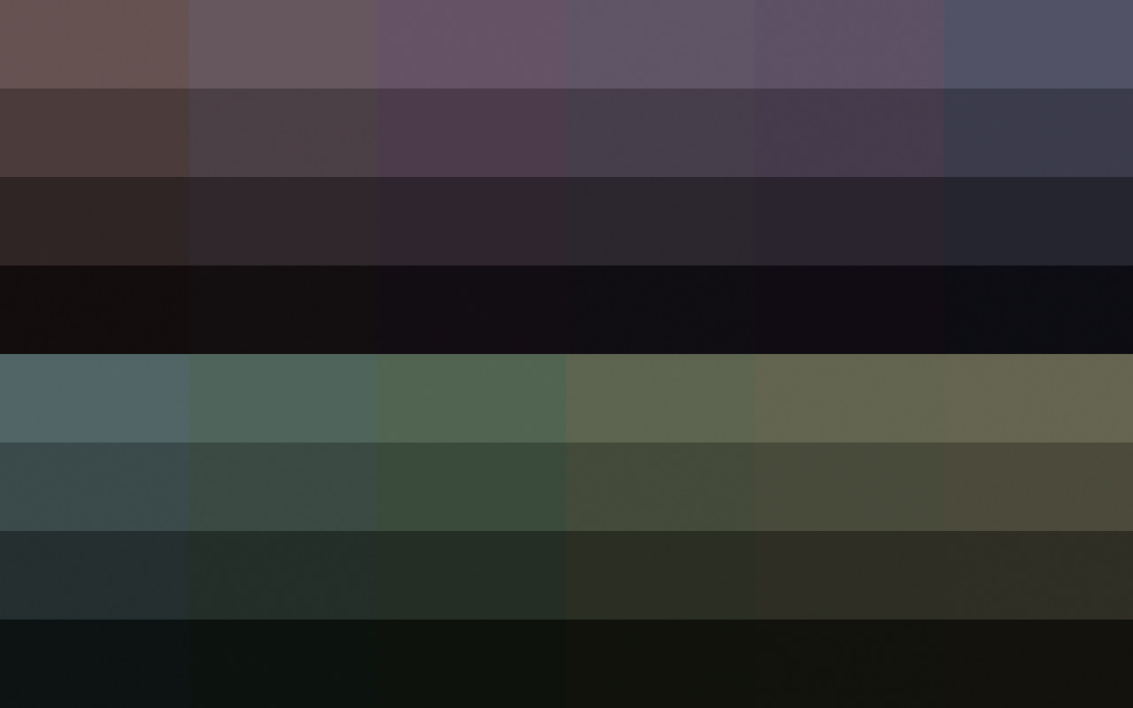
Now let's assess the gradation expression with some slightly different test images. Below are color patterns with a spread of pale colors in gradations close to the dark range and the light range. They are arranged so that a distinction cannot be made between adjoining colors on an LCD with insufficient gradation expression.
Color pattern of gradations close to the light range (Level of difficulty: Medium)
In this color pattern the colors gradually change from near-white pastels to gradations that are even closer to white. As the lightness of each color increases (the nearer it approaches to white), the more difficult it becomes to distinguish between adjoining colors.

Light color pattern |

Light color pattern |

Light color pattern |
Color pattern of gradations close to the dark range (Level of difficulty: High)
A color pattern where the lightness and hue gradually change. As the lightness of each color decreases (the nearer it approaches to black), the more difficult it becomes to distinguish between adjoining colors.
Dark color pattern |
Dark color pattern |

Dark color pattern |
We expect that you could roughly get the whole picture in the gradation patterns on the previous page, but in the patterns this time some parts that cannot be seen may have appeared in some cases. As we mentioned earlier, LCDs tend to display gradations close to black as a blocked-up shadows, and color patterns that are close to black are particularly hard to distinguish.
Since there are some parts that cannot be seen, the possibility arises subtle skin colors and tones cannot be accurately recognized when doing things like retouching photographs, though the misrecognition will vary according to the user's eyesight. People who place importance on color reproduction should probably bear this in mind when they think about replacing their LCD or buying an extra one.
Incidentally, when we checked the FlexScan SX2462W with these tests we could distinguish everything in both the close to white and the close to black patterns. As well as no blown-out highlights or blocked-up shadows, we saw no unnatural color casts.
 |
 |
|
|
This shows the color patterns displayed on the FlexScan SX2462W. It was taken with a digital camera so some parts look a little patchy but they were accurately displayed when we did a visual check. |
||
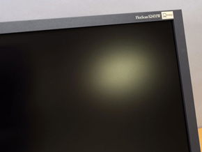
Brightness / chromaticity variation check
Along with gradation expression, it is easy to visually check brightness variation and chromaticity variation. Brightness variation scatters brightness around the screen and is easy to notice when you use full-screen display for things like drawing up documents or using spreadsheets. Chromaticity variation scatters color around the screen and is not as easily noticed as brightness variation, but it makes graphics-related displays unnatural and causes deterioration in color reproducibility.
Every LCD has some degree of brightness and chromaticity variation, but there are many products where the variations become more obvious when the brightness is lowered. A comparison of the brightness and chromaticity variation of a number of LCDs reveals that there is a fairly large difference between products, so this is a point to bear in mind.
|
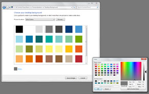
Brightness and chromaticity variation can be checked with standard Windows or Mac OS X functions. All you need to do is to set the desktop background to "Monochrome" and look at the whole screen from a little way away. Your check will be perfect if you change the desktop background to black, white, gray, then 100% red, green, blue, cyan, magenta and yellow, and then any "near-white pale color". If you actually try this test you may be surprised to find more variation than you expected when gray or a near-white pale color is displayed. Generally speaking, the center of an LCD screen is the brightest and it gradually gets darker towards the edges. This is no problem if there is not a big difference in brightness between the central and peripheral areas, but there are some products where this difference is very striking. |
An example of Windows 7 settings. Set the desktop background to "Monochrome" and then click on "Other". Prepare a color on the "Color settings" screen and use it as the background. (The background color cannot be changed in Windows 7 Starter.) |
Incidentally, this test is also an effective way to test the LCD for dot defects (normal lighting / unlit room). We would like you to check the black display in a darkened environment, for example by switching off all the room lights at night. Although you probably saw the whole screen as uniformly black in a light environment, very often in a dark environment you can find variations in some parts due to light leaks.
The FlexScan SX2462W got good results again when we tried it with the brightness and chromaticity variation tests. The brightness decreased slightly at the edges of the screen, particularly the lower edge, but overall the display was even and pleasing. It is installed with a "digital uniformity equalizer" that measures brightness and chromaticity throughout the screen and makes corrections so that the entire screen is uniform.
 |
 |
 |
 |
 |
 |
|
Monochrome full-screen displays on a FlexScan SX2462W. Only the screen display is shown. The bottom right is a near-white pale orange. There are not many LCDs that can display this kind of pale color as uniformly as this |
||
Viewing angle check
Recently LCDs have wider viewing angles and have achieved specifications of nearly 180° in both a vertical and horizontal direction.
However, the pitfall here is that it simply means that "the screen is visible". The thing is that the viewing angle specifications are permitted to use the term "visible" until the display contrast ratio drops to an extremely low 10:1 or 5:1 when the screen is viewed from an angle (the steeper the angle from which the LCD screen is viewed, the more the contrast generally declines). In other words, they do not take into account the display uniformity of the central and peripheral areas of the screen, or the level of chromatic change, when the screen is viewed from an angle.
The ideal viewing angles is that the brightness and chromaticity is very uniform and there is not much chromatic change, even when the screen is viewed from a slight angle. The viewing angles given in the specifications are not really very helpful, but you can judge the standard of the panel type that the LCD (liquid crystal panel) adopts. IPS liquid crystal panels have the least change in brightness or chromaticity when the screen is viewed from an angle, and they are followed by VA panels. An IPS or VA liquid crystal panel can be said to indicate the superior nature of the product itself, so this is often included in the catalog or specifications. It is probably a good idea to look through the catalogs of various products.
On the other hand, monitors installed with cost-effective TN liquid crystal panels are in fact the most numerous. However, the TN type lags far behind the IPS and VA types in terms of characteristic viewing angle changes in brightness and chromaticity. Simply viewing the screen from a slightly different angle makes the coloration change dramatically, and the screen looks completely different according to whether it is viewed vertically or horizontally. If the vertical and horizontal viewing angles in the specifications are different then it is a TN type. There are quite a few products with a 20-inch wide screen or larger where colors look different in the central and peripheral areas even when the screen is viewed straight on.
The display on an IPS panel. Even when viewed from this angle, the displayed content can of course be distinguished completely and the colors also show up really well |
The display on a VA panel. Compared with the IPS panel the screen is a little whitish and the chromaticity has slipped, but it is a satisfactory viewing angle for actual use |
The display on a TN panel. There is a very clear difference from the IPS and VA panels. The display throughout the entire screen lacks uniformity and there is a yellow cast |
The gradation images and monochrome images from earlier in this article can be used as they are to check the viewing angles. Display an image on the whole screen, look at it straight on and check whether the brightness and colors are uniform at the top and bottom of the screen, and in the center and at both sides. Then gradually shift the angle from which you view the screen and check how the brightness and coloration change. If you do this with photographic data as well as the test images, you should be able to get a better sense of the difference in the display.
When we checked the viewing angles of the FlexScan SX2462W there was absolutely nothing to criticize since, in addition to the use of an IPS panel, it is equipped with many high image quality functions, including the afore-mentioned digital uniformity correction circuit. The brightness and chromaticity throughout the whole screen is very uniform, and the coloration hardly changed at all when the viewing angle was changed.
Naturally, this is very impressive when doing things like photo retouching, but it is also very pleasant at times like when many people are looking at videos or photographs. You can get a perfect understanding of the viewing angles by a visual check of the display so, if possible, we would like you to check this in the store. You will probably be particularly amazed by the difference between IPS / VA types and TN ones.
 |
 |
 |
||
|
The display on the FlexScan SX2462W. As expected, the display did not change even when the vertical display function was used, or when it was viewed from a very sharp angle |
||||
It's best to insist on display quality when choosing an LCD
We explained here about easy ways to check LCD monitor quality. How were the results for your current LCD? We think that many people were probably very bothered by the blocked-up shadows and blown-out highlights when the test images to check gradation were displayed, by the middle gradation banding, and by the variations in brightness and chromaticity when the monochrome images were displayed.
As we mentioned at the beginning, recently the number of LCDs with excellent display quality is on the decline. Although we would not go so far as to say that the display quality of inexpensive products is poor. Of course a high quality LCD is indispensable if you want to enjoy using your computer, properly handle the needs of applications that require color reproducibility, and to fully enjoy all the benefits of rich content.
The EIZO FlexScan LCD series has excellent display quality in those regards, and we have no qualms about recommending them to everyone. The product line-up is diverse but each model is clearly ranked according to the purpose to which it is suited and its screen size, and they all guarantee above-standard display quality. They may cost a little more than you had budgeted for but the clear value they offer exceeds their price.
If, after trying these tests, you have doubts about the display quality of the LCD that you usually use, we would certainly urge you to consider an EIZO LCD. We would also recommend that you construct a multi-display environment by making the new LCD your main monitor and the one that you have been using your sub monitor.